


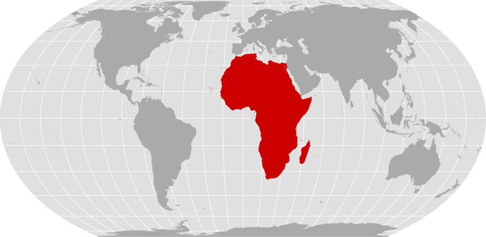
On Sept. 4, 2026, the United Nations General Assembly endorsed the Equal Earth projection, an equal-area world map published in 2018, and encouraged governments, schools, media, and technology platforms to use it wherever the comparative size of continents matters.
The United States cast the sole vote against, dismissing the initiative. Yaryna Ferencevych, the U.S. deputy representative to the U.N. Economic and Social Council, described the initiative as part of a broader “radical ideological project” being pursued by the U.N. when it should be focused on “genuine problems of international peace, prosperity, or good relations.” “Resolutions like this and the ideological agenda they promote are barnacles on our work here, and the reason this institution is losing its credibility,” she said.
“Maps shape our understanding of the world,” Robert Dussey, Togo’s foreign minister, said before the vote. “They guide education, nourish the imagination, and influence collective perceptions.” The vote followed a “Correct the Map” campaign backed by the African Union and led by Togo, and was passed with the support of 164 nations, including France and the UK. Six countries, Estonia, Georgia, Lithuania, Moldova, Serbia, and Ukraine, abstained.
The campaign argued that the Mercator map, developed in 1569, misrepresents the size of continents, particularly Africa, and carries unfair connotations of power and privilege. In 1569, Dutch cartographer Gerardus Mercator created a world map using what is now known as the Mercator projection. On this map, all meridians are drawn as parallel vertical lines. In geometry, a straight line crossing parallel lines forms the same angle with each one. As a result, a straight line drawn across a Mercator map represents a constant direction.
For sailors, the Mercator map made navigation much easier. They could draw a straight line in the direction they wanted to travel and use it to guide their journey. Because of this advantage, the map remained widely used for centuries, especially during the age of navigation comfort in the seas.
However, it does not portray the true size of landmasses covering areas. Regions nearer to the North and South Poles appear much larger than they actually are, while regions near the Equator appear smaller. This leads to an outcome that the US, Europe and Russia look unusually large in visual effect. The clearest example is Greenland, which appears almost as large as Africa even though Africa is actually about 14 times bigger.
In 2018, three scientists, Bojan Šavrič, Tom Patterson and Bernhard Jenny, developed the Equal Earth projection to accurately reproduce the proportional areas of the continents. On maps produced using this method, areas near the Equator, including Africa, Latin America and South Asia, appear substantially larger, while the US, Europe and Russia look smaller. The Equal Earth map projection is a new equal-area pseudocylindrical projection for world maps. It is inspired by the widely used Robinson projection, but unlike the Robinson projection, it retains the relative size of areas.
Meanwhile, Ukraine voiced objections over how some maps relying on Equal Earth portray Russian-occupied Ukrainian territory, according to the U.N. However, the Eastern European country supported actions to more accurately depict Africa’s size. The campaign has attracted support for the equal projection map beyond the African region. The Caribbean Community’s Reparations Commission has also endorsed shifting away from Mercator and highlighted the issue of equal historical representation. Latin American governments also appeared as the resolution’s supporters. Countries like Belize, Brazil, Costa Rica and Nicaragua were listed among the states supporting the draft.
France has chosen Eckert IV for official mapping, demonstrating that the debate does not centre on a single replacement for Mercator. Eckert IV is an equal-area pseudocylindrical map projection for world maps. The lateral meridians are semicircles, which give the projection a rounded shape and smooth corners where the lateral meridians meet the pole lines. This projection is commonly used for thematic and other world maps requiring accurate areas.
The debate over the world map is therefore about more than cartographic accuracy and traces to rightful historical representation of maps. The Mercator map remains a useful tool for navigation, but its use in classrooms, newsrooms and public institutions has shaped a distorted image of the world representation in the map.
It is essential that geographic representation should be given in a map according to the physical area of the region to offer a fairer representation of Africa and the wider Global South. This would change how people see the world and whose place within it is visually recognised.